The number that made me want to tap
The first version of Best Effort was just numbers. Every time I looked at it, I wanted to tap it — to see where on the route that fastest split actually happened.
The first version of Best Effort was just numbers. Open a run, scroll to the Best Effort card, see your fastest 1K, 5K, 10K, half marathon times. Clean and correct.
Every time I looked at it, I wanted to tap it. Not because anything was wrong — but because a time like 24:20 always made me wonder: where on the route did that happen? Was it the flat stretch near the start, or did I somehow run my fastest 5K in the back half?
So I built the answer.
Where did that happen?
Tap any best effort and it opens the full map with the segment pinned directly on the route. Numbered markers show where each effort started and ended, the route highlights the exact stretch, and the pace chart below lights up the same window. Switch between distances using the pill selector at the bottom and the map updates in place.
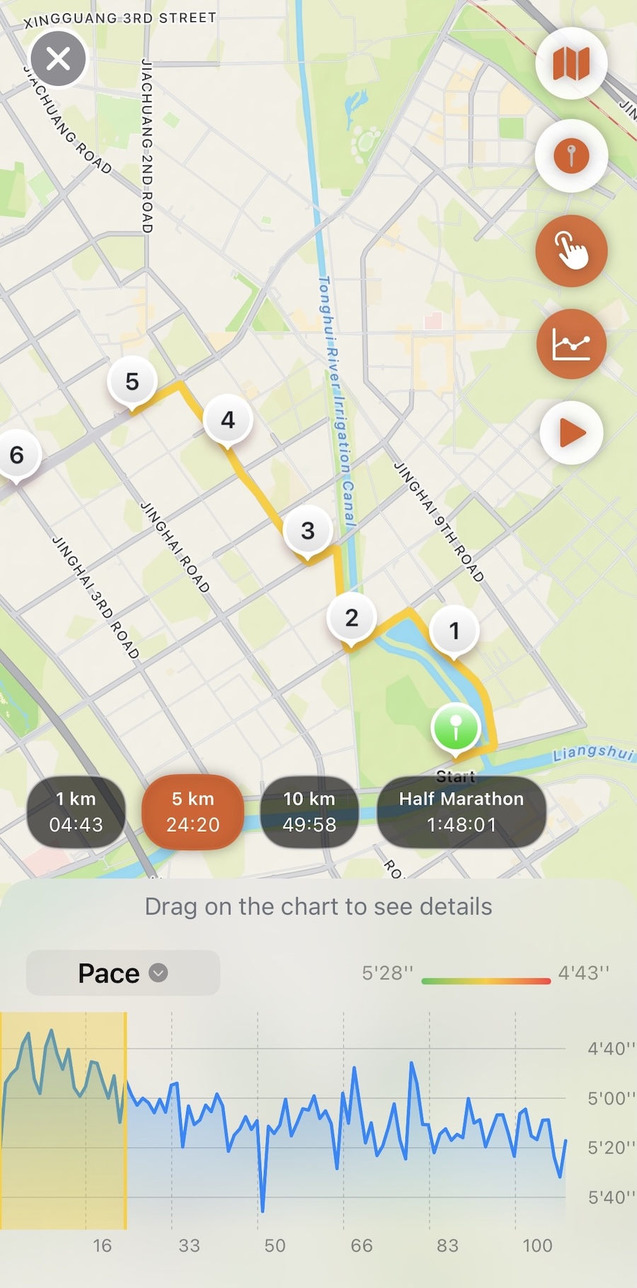
The number was always right. Now you can see where it came from.