The facts it couldn't show
Same friend. He liked Running Facts for his easy runs. Then he finished an outdoor interval and sent me another screenshot — average pace, no work pace, no rest pace, nothing split. So I built an interval edition.
Same friend.
After the interval share template shipped, he started using Running Facts for his easy runs — sent me a screenshot a few weeks later, said it was exactly what he wanted. Then last month, another message. This time it was an outdoor interval.
The share card showed average pace. No work pace. No rest pace. Heart rate collapsed into a single number. Work time hidden inside total duration. “This could be any run,” he said.
He was right again.
Two states, one average
Running Facts assumes a single-state run. One pace, one heart rate, everything averaging cleanly across the whole distance. For an easy 8km, that works fine.
An interval run is always two things alternating: effort and recovery. Collapsing that into one average pace turns 4'58’’ work and 7'27’’ rest into something in the middle that describes neither. Same problem with heart rate, same problem with time.
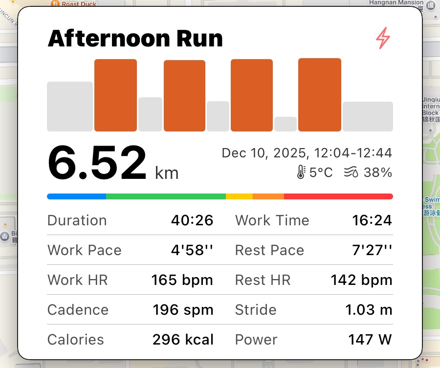
What the card shows now
The outdoor interval template keeps the bar chart at the top — same visual language as before, orange work bars and gray rest bars, the pattern of the session at a glance. Below it, a two-column table: left side is work, right side is rest. Work Pace next to Rest Pace. Work HR next to Rest HR. Work Time next to total Duration. The layout is the workout.
Now when he shares an interval, it looks like one.