Fast or slow, at a glance
After a long run, scrolling through 20+ splits and mentally comparing each pace to the average is tedious. So I drew a line. Orange bars are faster than average. Blue bars are slower. Now you see the whole run's rhythm instantly.
After a long run, I’d open the splits view and stare at 20-something pace numbers, trying to remember the average so I could mentally sort which were fast and which were slow. It’s a small friction, but it adds up every single time.
One day it clicked: just draw the line.
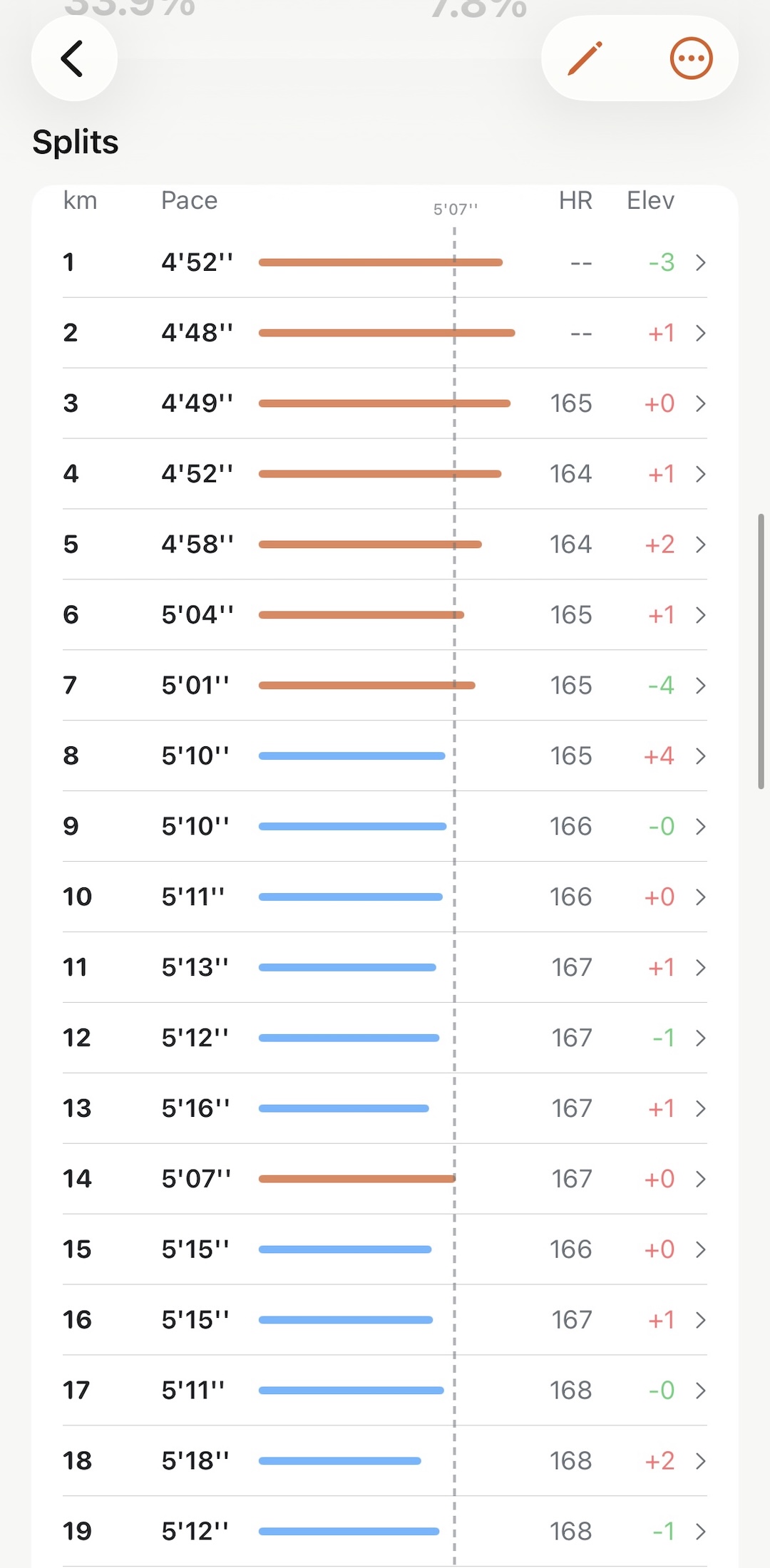
A dashed vertical line now sits at your average pace. Each split bar is colored by which side it falls on — orange if you were faster than average, blue if you were slower. No numbers to compare. No mental math. The whole run’s rhythm is right there.
Especially useful for long runs, where the pacing story tends to get interesting after km 10 or 15. A string of blue bars late in the run tells you something. So does a cluster of orange ones early.